
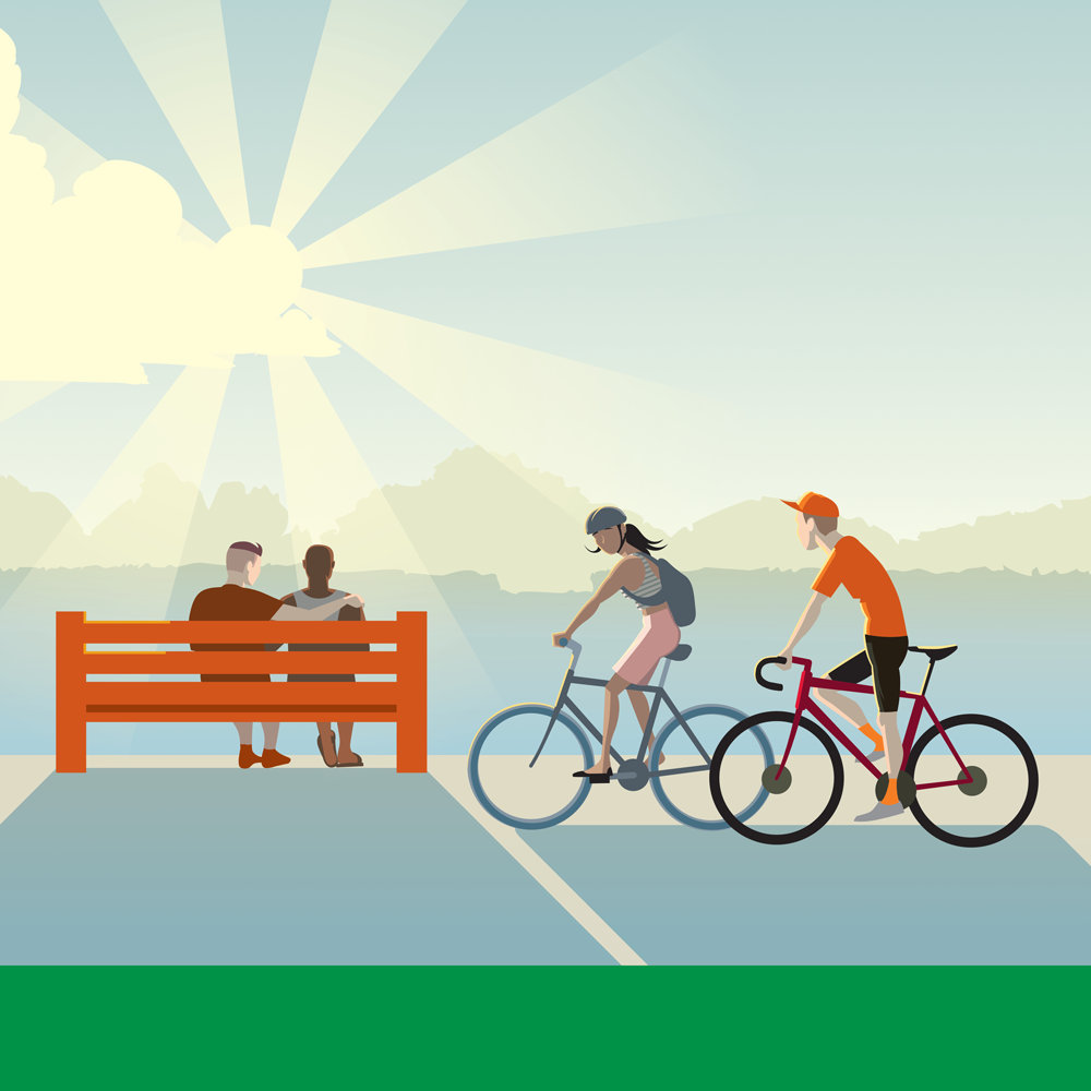
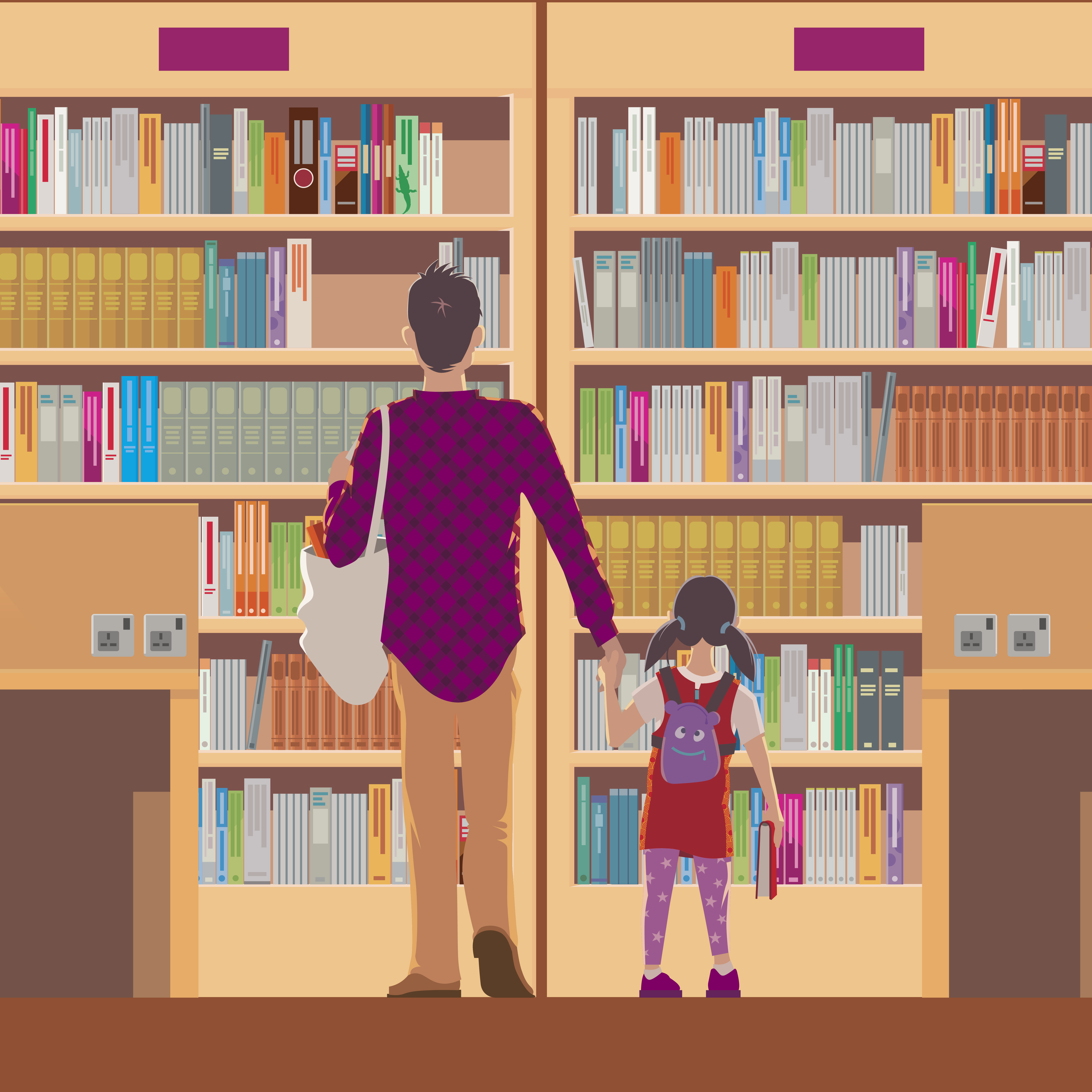
As varied as my design career has been, the one thing that has tied it all together is my love of illustration. I've had a pen or a brush in my hand constantly since I was little, and technology has given me new creative avenues to explore. While most of my output is created in vector apps, I'm still pretty happy with a fineliner and a moleskine.
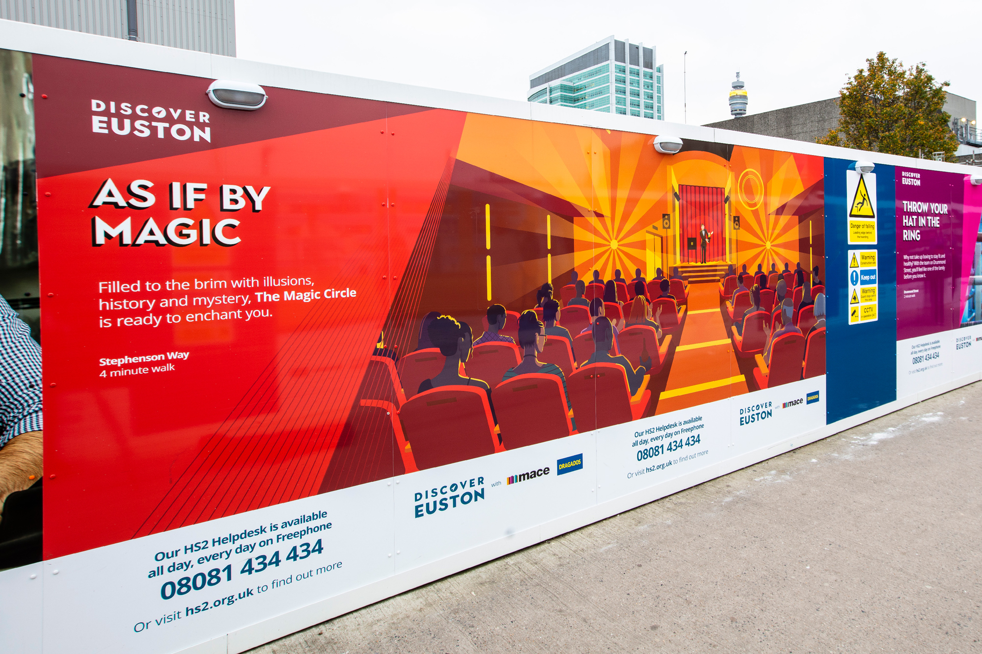
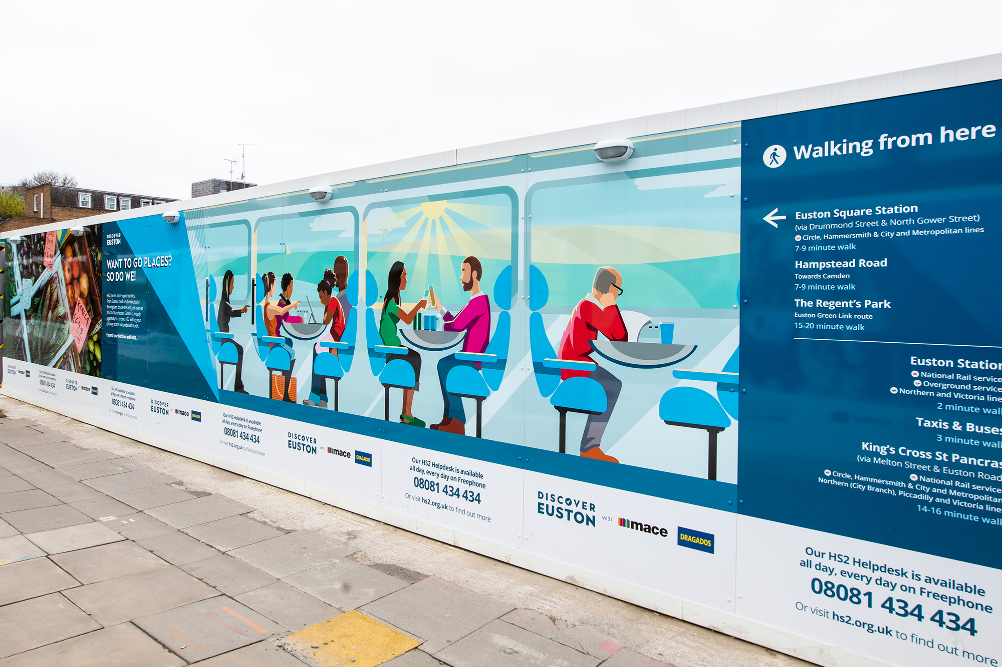
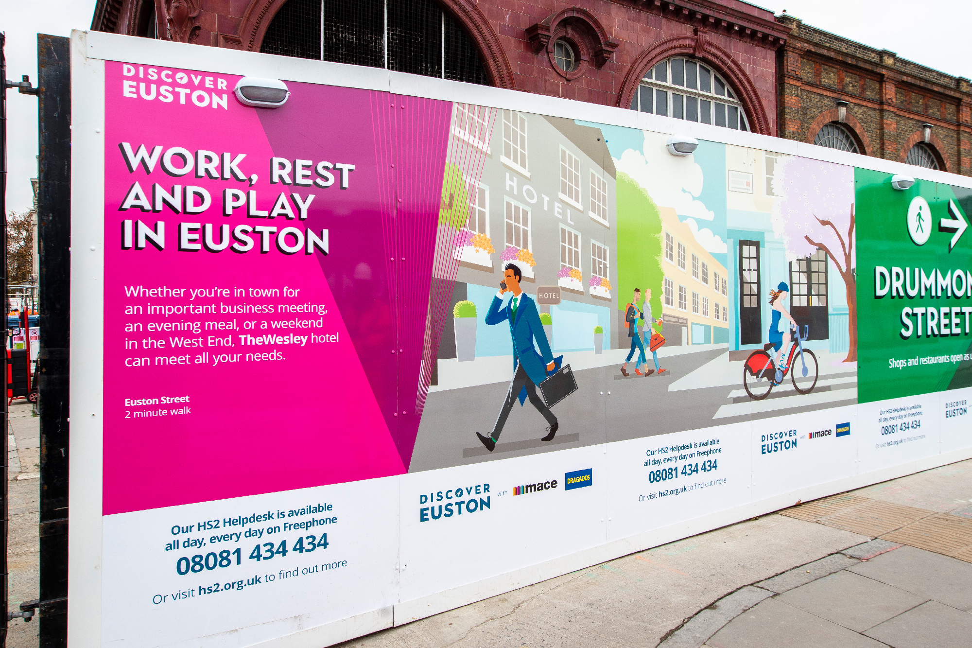
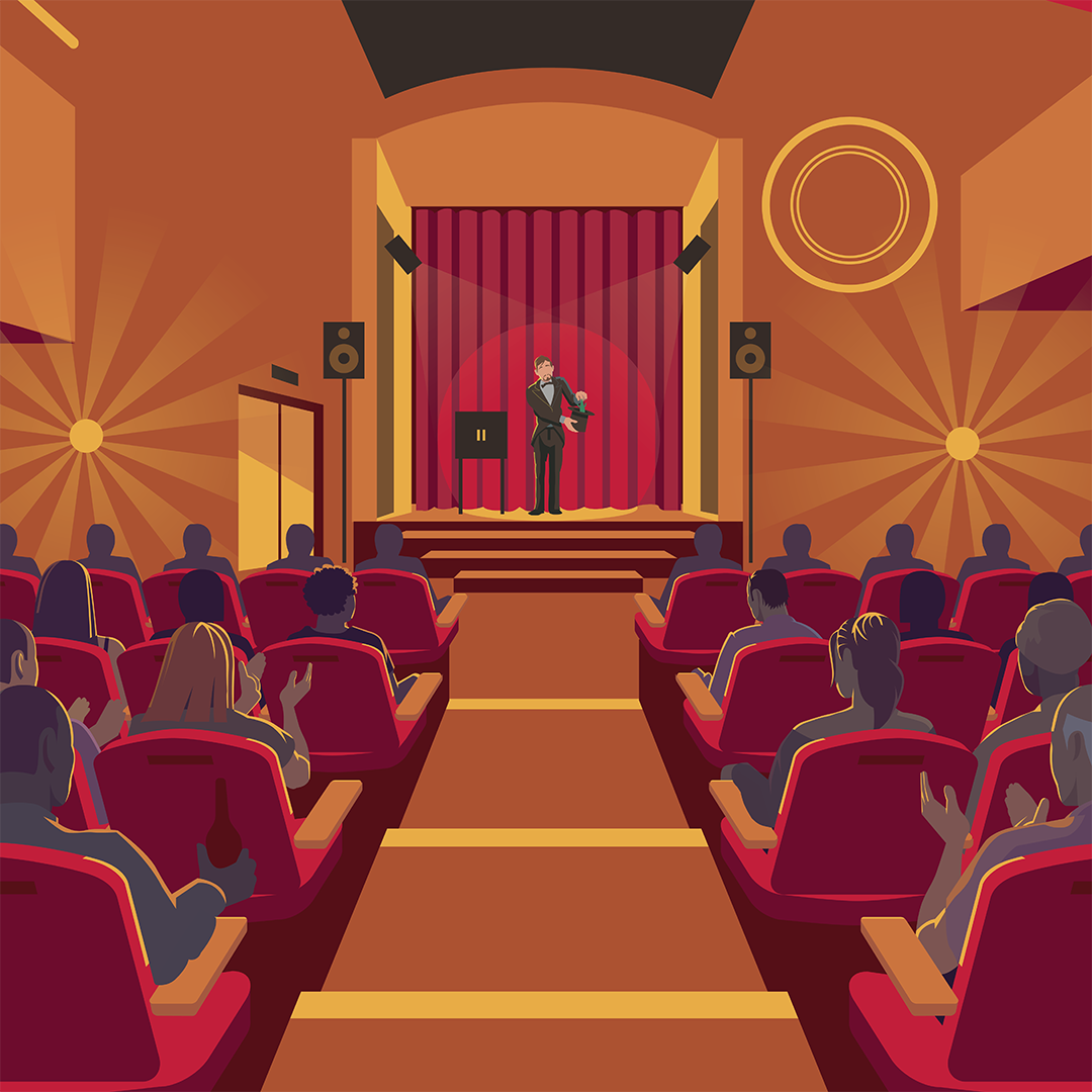
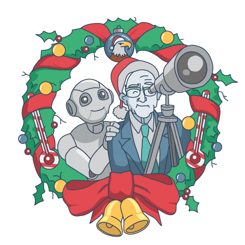
The brief was to create a set of 20+ illustrations to be used on the hoardings around various construction sites in the Euston Station area. The visual references included original rail travel posters from the 1930s. The style takes this reference as a jumping-off point, and aims to create something modern while still alluding to classic rail travel advertising.
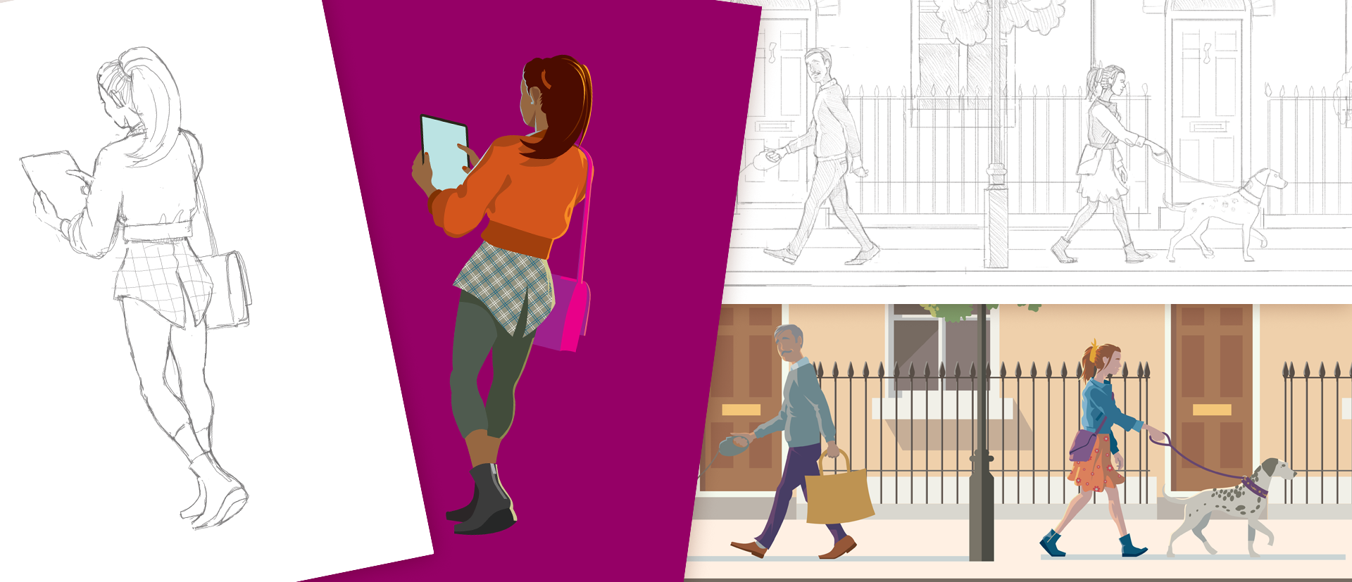

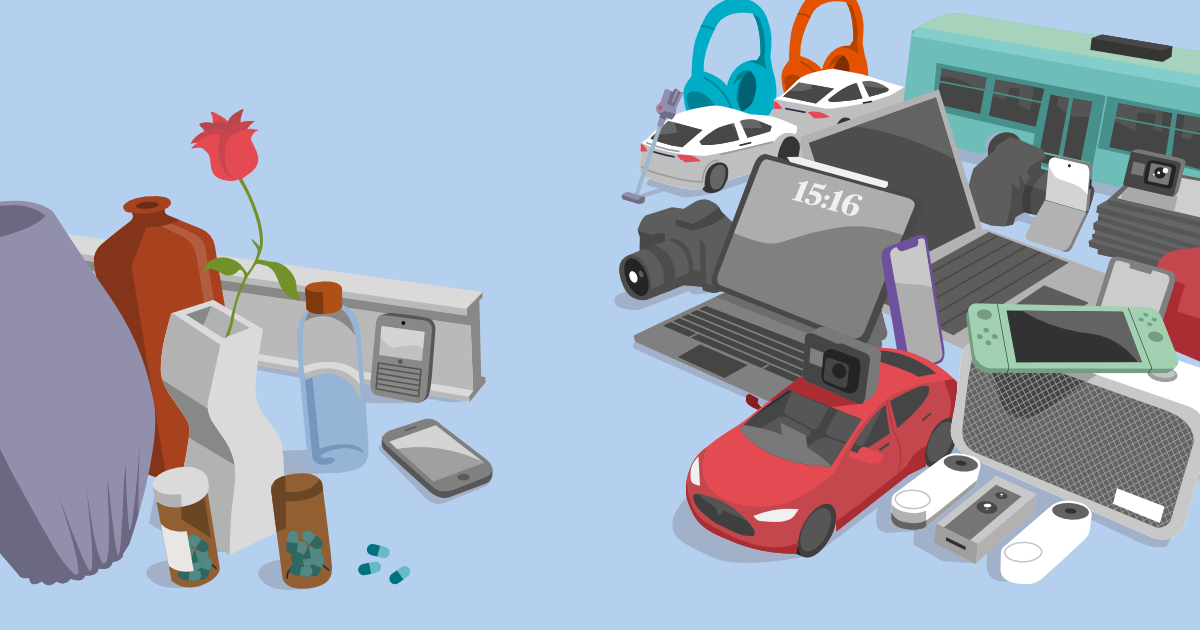
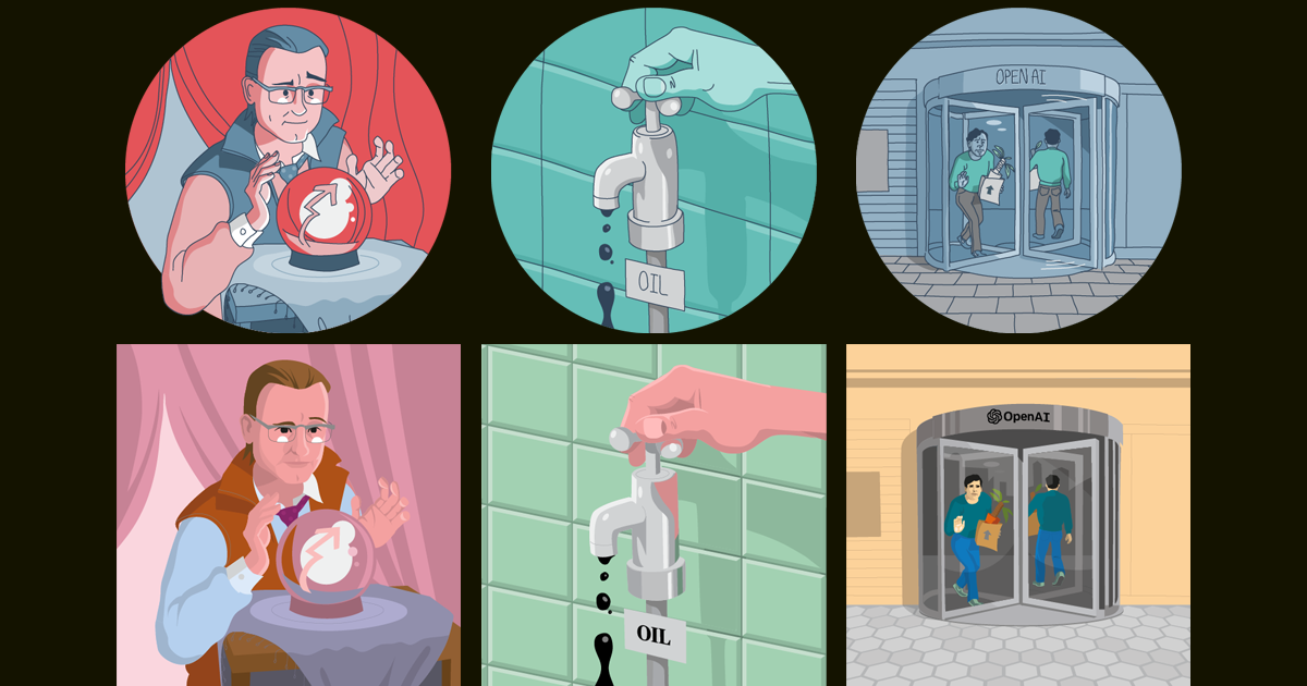
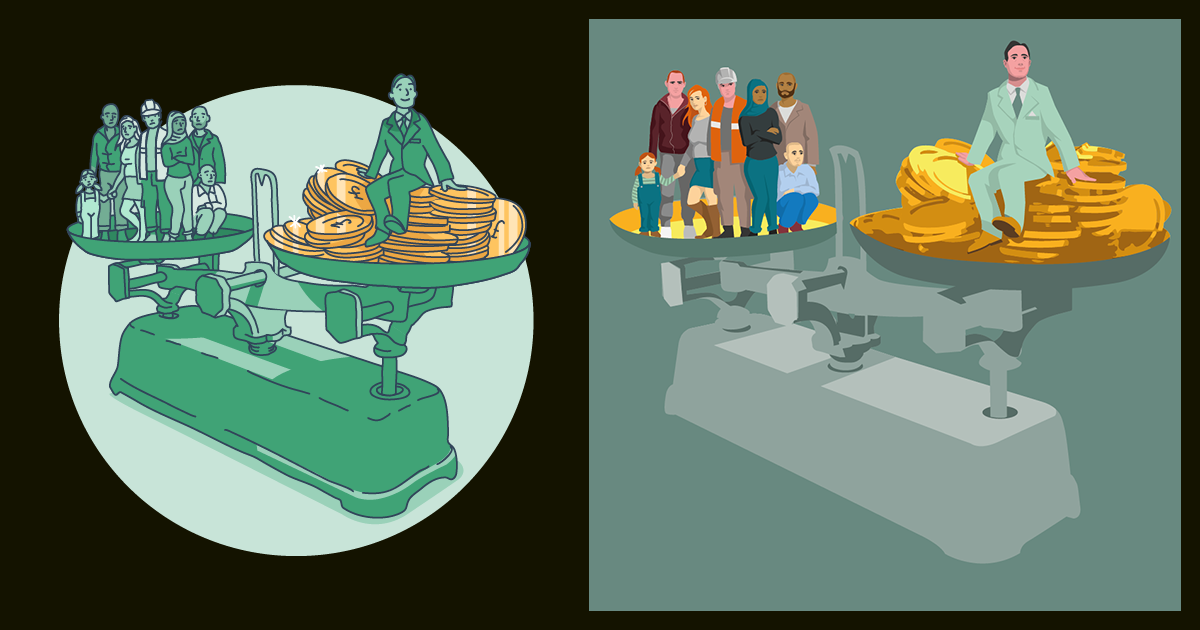
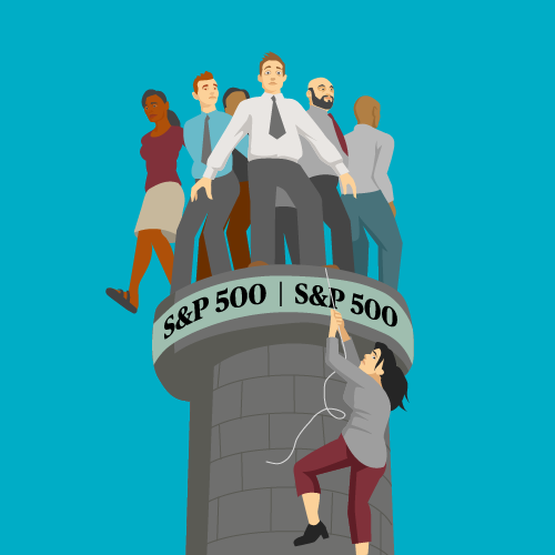
I was recruited by Architas – an investment management firm – at the end of 2023. They had recently been acquired by a bigger name in the field and were going through a rebrand, which meant a transition between illustration styles. What this meant for me was that illustrations needed to be created in both the former, more cartoony style, and the incoming flat-colour approach. The challenge was the seeming incompatibility between the two, and some much stricter subject matter rules.

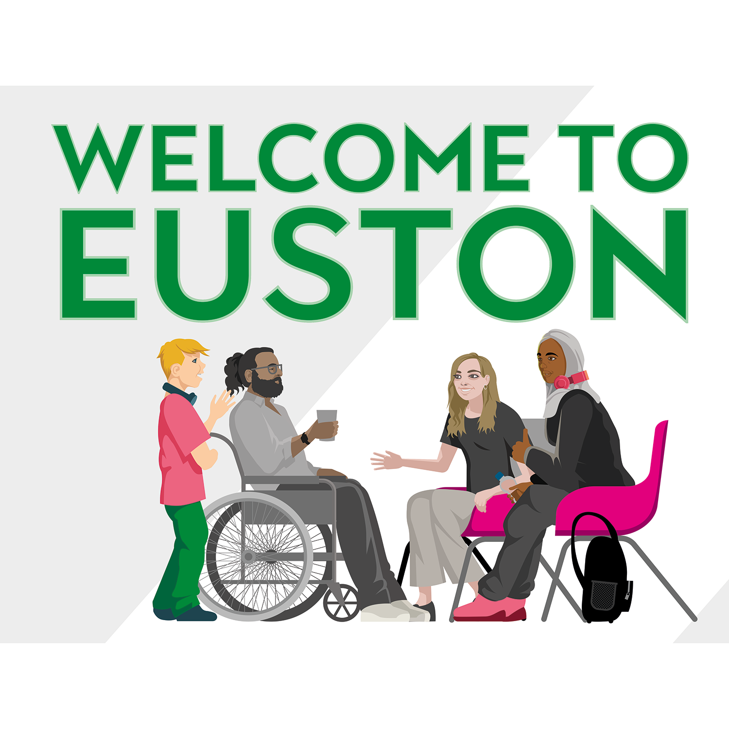
The Euston Community Hub is a vibrant space created with local people, for local people, to support and benefit the communities around Euston.Located in the old Maria Fidelis school, the Euston Community Hub is a place for Euston residents to work, play, meet, discuss and discover.The Euston Community Hub was established by the Euston Partnership, a collection of organisations working together on the redevelopment of the Euston area.
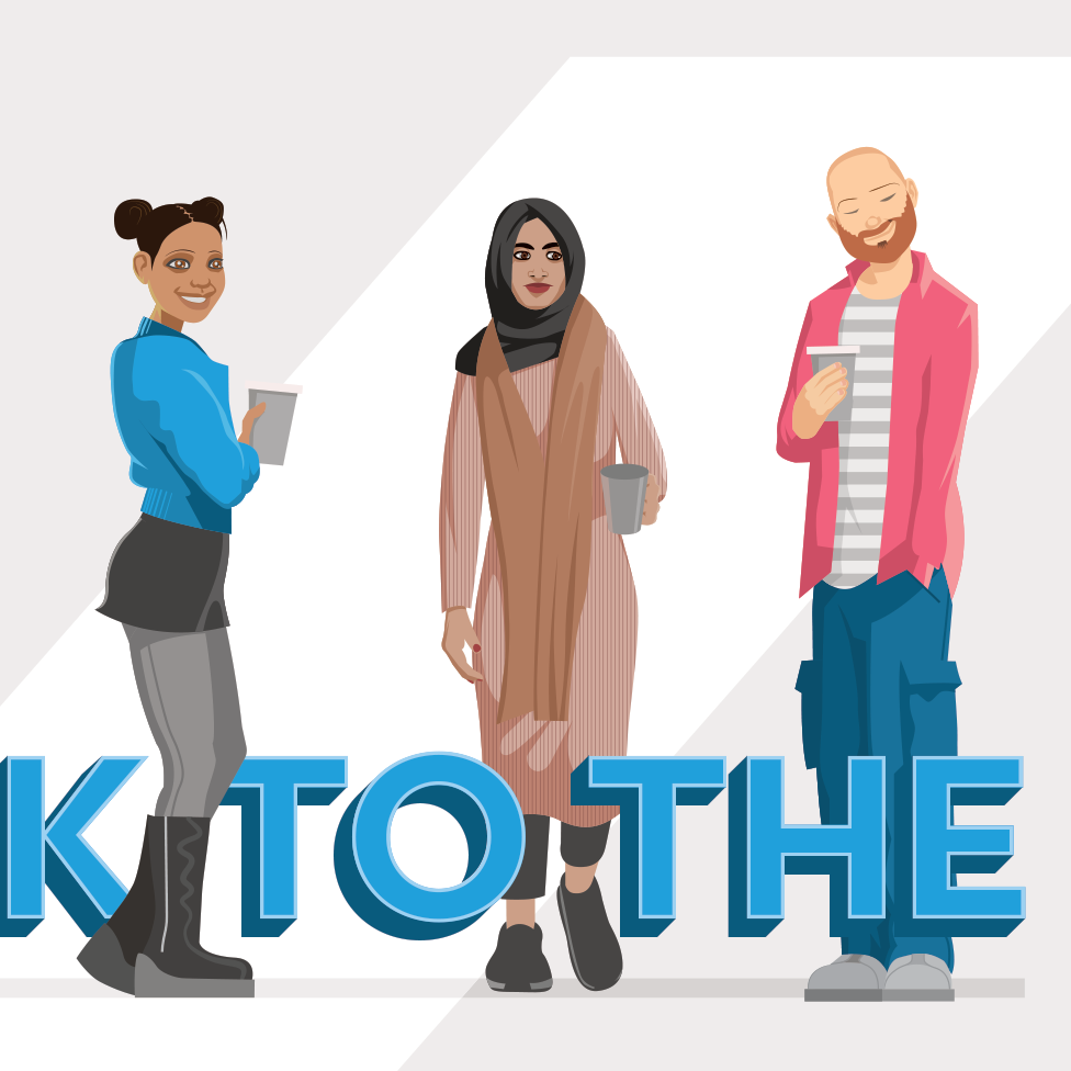
I was asked to provide wall art, signage and standees, using likenesses of regular visitors to the Hub space. The challenge was a limited amount of reference material for the people in question. Likenesses of real people can be a tricky balance, especially when you only have one shot of each of them, but everyone was really pleased with the results.
This is the final mural used in the main communal area:

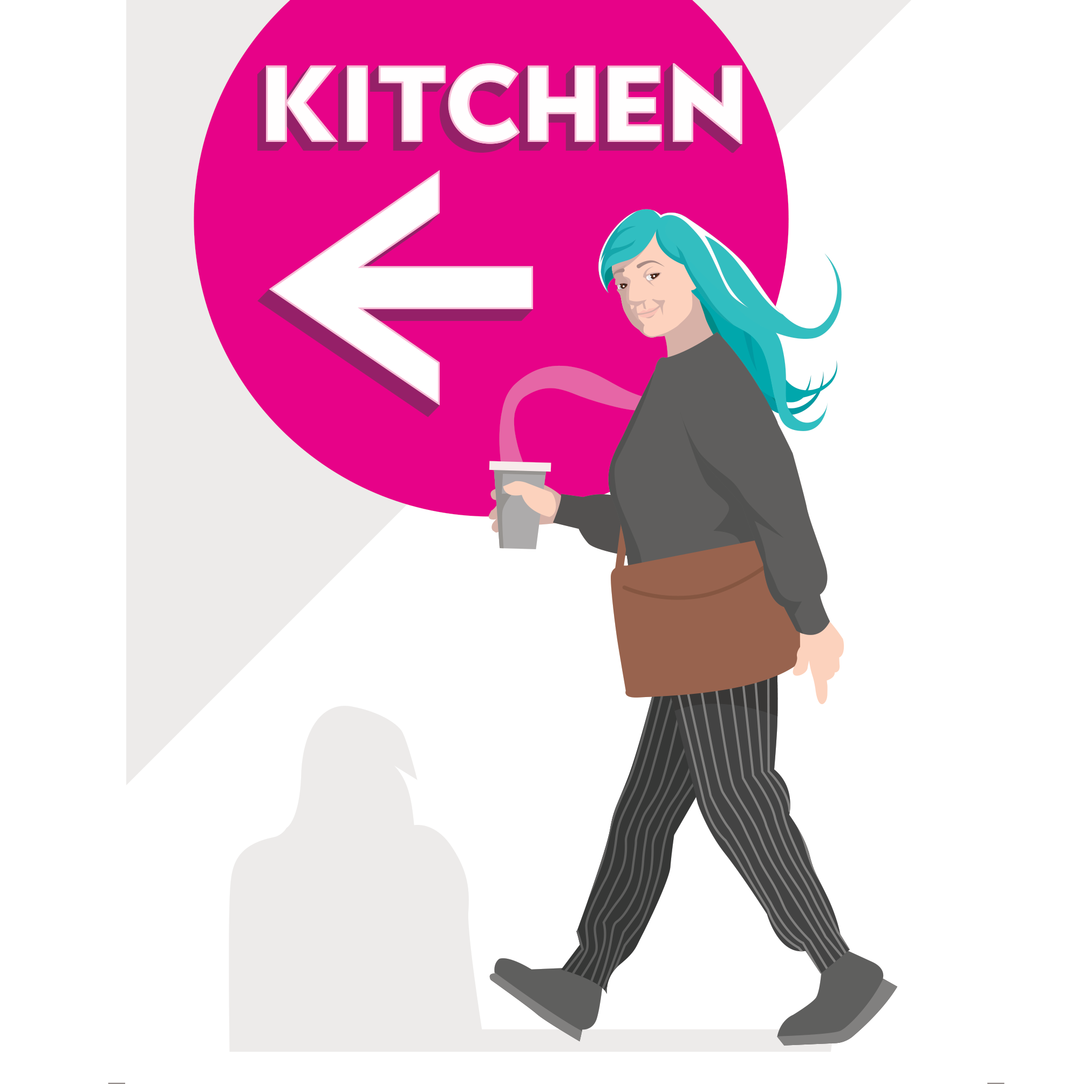
The second phase was creating signage and wayfinding, re-using some characters and creating some new ones:
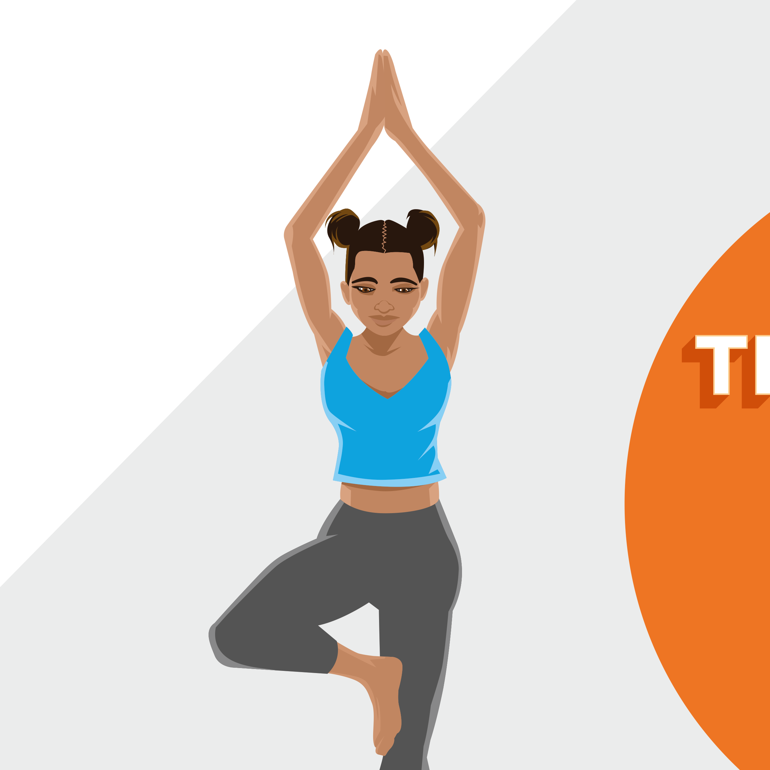

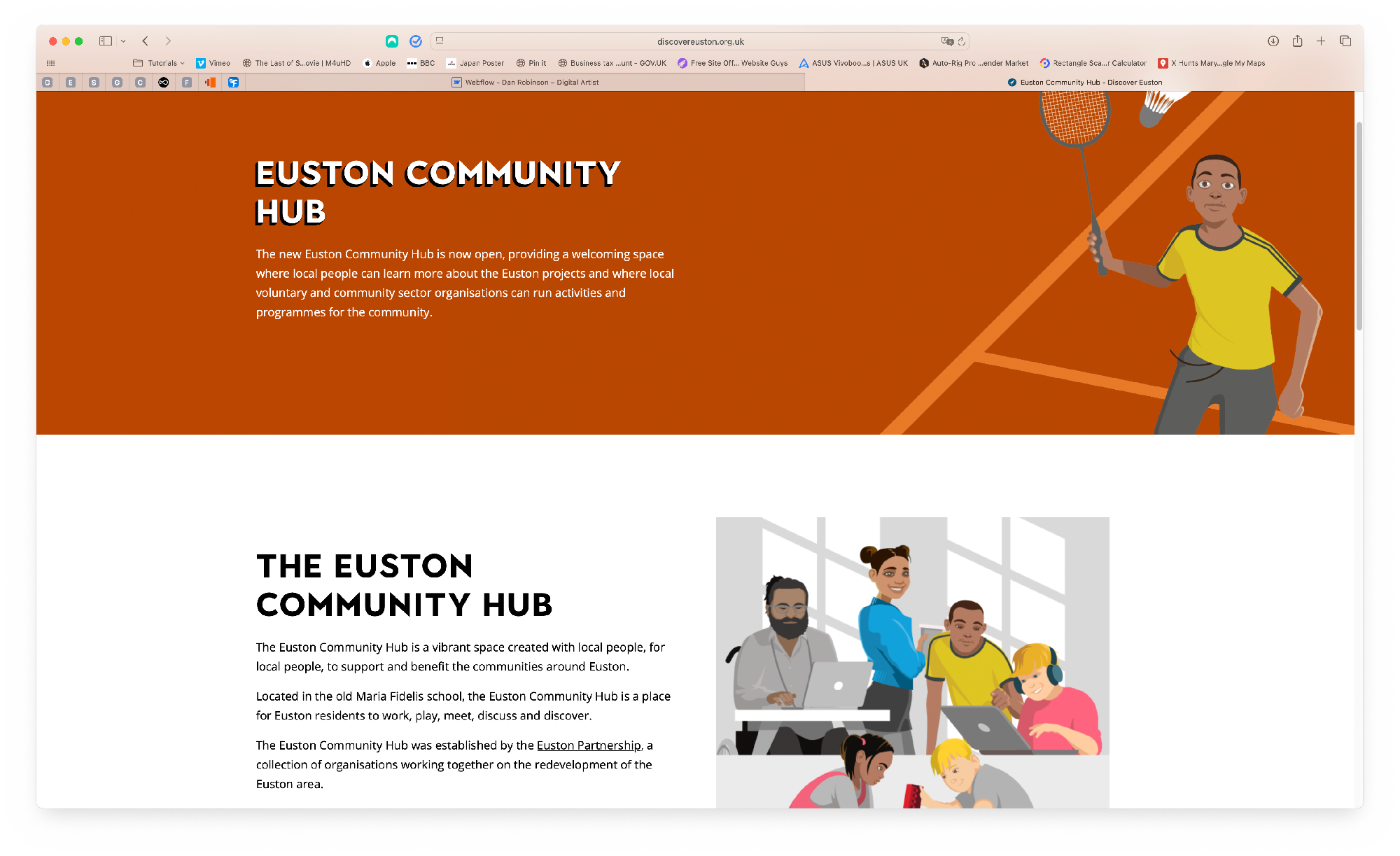
Character designs were reused for the web graphics.
The final phase was creating life-size standees of various characters. Measurements were supplied and in most cases, weren't too far off. These have been placed in various locations around the hub.